


B I C ⋆ S I M P L I C I T Y IN F O U R C O L O R S
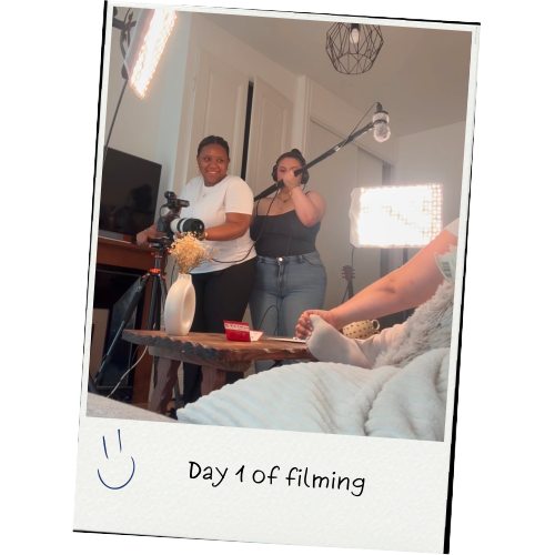
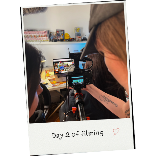
30-second advertising concept created during the Master's program Communication & Audiovisual creation.
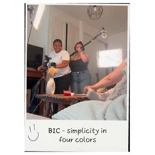
30-second advertising concept created during the Master's program Communication & Audiovisual creation.
F I R S T . . . S O M E C O N T E X T
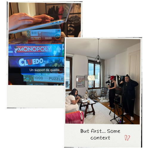
This project was created during the second year of my second Master’s degree in Communication & Audiovisual Creation at Sup de Pub Lyon. Our final year was divided into two major projects: a music video to be produced during the first semester and a 30-second advertisement based on BIC’s four-color visual style.
Contribution to the creative concept
M Y R O L E
Contribution to the artistic direction
Sound recording during filming
Contribution to video editing
A N I D E A W A S B O R N
At first, the whole class was puzzled:
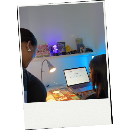
It was a personal anecdote shared by one member of the team that sparked our concept.
Originally from Madagascar, she talked about the difficulties she faced when completing administrative procedures online: bugs, rejected signatures, endless loading times… until she laughed and said:
“It would almost be faster to do everything by hand!”
That sentence triggered everything.
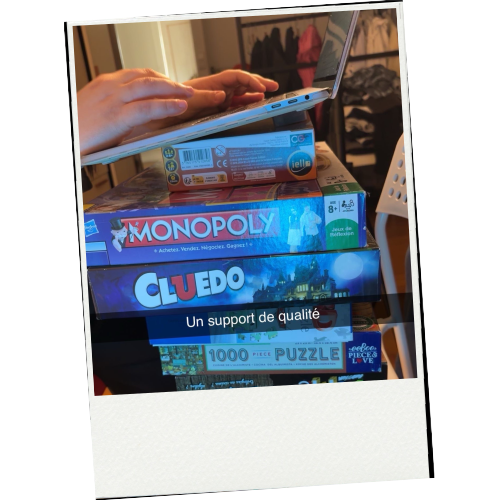
We imagined an advertising concept built around an absurd parallel between the complexity of digital tools and the rediscovered simplicity of paper and pen.
How do you make something as ordinary as a BIC pen feel creative?

C R E A T I V E C O N C E P T
The film is built around an alternating edit:
On one side, a woman lost in online administrative procedures, overwhelmed by bugs, intrusive pop-ups and error messages.
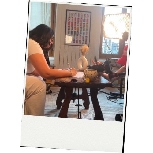
On the other, a calm and composed woman peacefully filling out her form by hand, using a four-color BIC pen.
The humorous contrast between digital stress and analog serenity conveys the brand’s message:
“Simplicity, in four colors.”

Brainstorming sessions around the theme of "simplicity"
Analysis of existing BIC advertising campaigns and identification of possible tones
Scriptwriting, storyboard creation and technical shot list.
Thinking & Writing

Preparation & filming
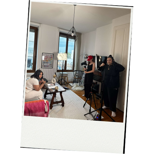
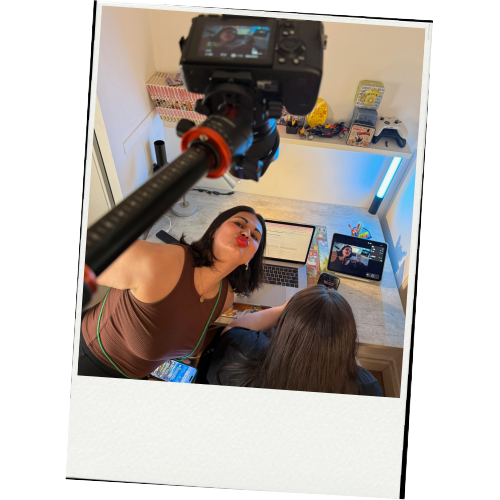
Team organization in pairs for sound recording, cinematography and directing
Managing technical constraints (street noise, lighting changes due to weather conditions)
Two distinct artistic directions: cold lighting, fast-paced rhythm vs. warm lighting and a cozy atmosphere.


This project helped me understand the importance of a simple yet powerful concept in an advertising campaign: starting from an authentic, everyday anecdote to create a clear and universal message.





W H A T T H I S P R O J E C T T A U G H T M E?
This project was created during the second year of my second Master’s degree in Communication & Audiovisual Creation at Sup de Pub Lyon. Our final year was divided into two major projects: a music video to be produced during the first semester and a 30-second advertisement based on BIC’s four-color visual style.

M Y R O L E?

Contribution to the creative concept
Contribution to the artistic direction
Sound recording during filming
Contribution to video editing
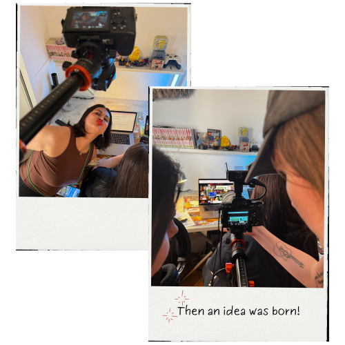
At first, the whole class was puzzled:
How do you make something as ordinary as a BIC pen feel creative?

It was a personal anecdote shared by one member of the team that sparked our concept.
Originally from Madagascar, she talked about the difficulties she faced when completing administrative procedures online: bugs, rejected signatures, endless loading times… until she laughed and said:
“It would almost be faster to do everything by hand!”
That sentence triggered everything.
We imagined an advertising concept built around an absurd parallel between the complexity of digital tools and the rediscovered simplicity of paper and pen.
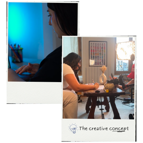
The film is built around an alternating edit:
On one side, a woman lost in online administrative procedures, overwhelmed by bugs, intrusive pop-ups and error messages.
On the other, a calm and composed woman peacefully filling out her form by hand, using a four-color BIC pen.
The humorous contrast between digital stress and analog serenity conveys the brand’s message:
“Simplicity, in four colors.”
Thinking & Writing

Brainstorming sessions around the theme of "simplicity"
Analysis of existing BIC advertising campaigns and identification of possible tones
Scriptwriting, storyboard creation and technical shot list.
Preparation & filming
Team organization in pairs for sound recording, cinematography and directing
Managing technical constraints (street noise, lighting changes due to weather conditions)
Two distinct artistic directions: cold lighting, fast-paced rhythm vs. warm lighting and a cozy atmosphere.

Ce projet permet de comprendre l’importance du concept simple et fort dans une campagne publicitaire : partir d’une anecdote authentique pour créer un message universel.
W H A T T H I S
P R O J E C T T A U G H T M E

MARIE SPYRIDAKIS

Video creation, visual identities and communication strategies for brands and creative projects.
© 2026 Marie Spyridakis - All rights reserved.